My one page website is named "Music that rocks" as it is all about heavy metal rock, bands such as Iron Maiden, ACDC, Motorhead etc. I chose to do this topic as I enjoy listening to this kind of music and see rock bands whenever I can.
 My target audience for my site is for both males and females as this kind of music can appeal to anyone, I believe my site meets this target audience as it has elements of young and old within it both male and female, the young, being the hip background and old being the rough and rugged text. However the colours stick to the rock theme keeping to black and dark colours with a contrast of white, and a hint of red which could be related to fire or blood.
 The site also gets money for advertising on their site this is good way to make business on your website as you can use pay per click (PPC), which is where the advertising companys pay the website owner everytime the advertisment is clicked and is a good way of makin money for the website.
By incorporating Social networking into my website such as Facebook and Twitter it helps my website connect with the networking community, By having Facebook linked to my site which has more than 800 million active users it helps me share information with thousands across the network by them liking my page sends out information, updates and links which will lead them to clicking directly to my website, this helps with information sharing, sending information from our site straight to Facebook and twitter users and will bring more people to the site.
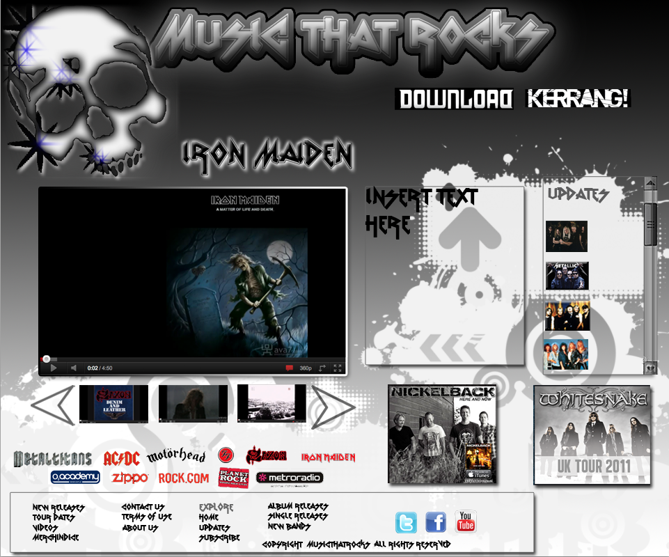 This was my Photoshop design of my website, essentially the draft, I think its looks appealing and eye-catching and relates well to the theme however I forgot to take into account keeping within guides and sizes of the logo and spacing between itself and the header so I had to adapt in dreamweaver to make it look as similar as possible to the layout I did in photoshop. I think the concept and overall designing of the page layout is simple not to cluttered, making the text boxes look as if the background has been lifted from the background itself for the text i thought was an interesting and creative look to the website and gave it a great look. When making my website I have to take into account Copyright permissions, as I have images from bands and for me to be able to use this I would have to contact the band direct e.g I would have to contact Iron Maiden or their record company and ask their permission to use an image or video of them if i did not do this I would risk going to court.
 Some heavy metal bands are known for their violent approach to music, so I would have to take ethical considerations, choosing album covers and content carefully as some bands albums could be offensive to certain religions or people of a different views such as Black Sabbath- Heaven and Hell album as it is showing angels smoking, this could offend anyone with the beliefs of angels being messengers of god,protecting and guiding them such as Christians.
  The software I used for my one page website was Adobe Dreamweaver CS5.5 for my main final design which goes live, my one page website was made on a HMTL page which stands for Hyperlink text markup language, HTML is basically lots of codes in which the browser site reads to tell the browser what the website should look like and how it should work.
 I used Adobe Photoshop CS5.1 for my draft website and to make my logo, I also used Inkscape and Safari. I also used CSS to make my website through using codes in a style sheet. CSS stands for Cascading Style Sheets, which is a style sheet language which is commonly used to style webpages written in HTML. To make my website cross browser format I made my website live and tested it out in browers such as Mozilla Firefox, Google Crome and Internet Explorer, I tested my website out in different browsers because in some browsers the website changes and looks different as each browser can read the HTML differently than others so i had to test that it worked in different browsers, when I previewed my website in these three browsers it looks ok as everything was inside the viewing screen and images and content were all where they should be placed however the background duplicated which was a downfall as I felt the site did not flow as good as it would with just one continual background and that that background was to dark at the top.FTP stands for File Transfer Protocol, I used Filezilla which is a free ftp client, basically taking files and transferring them into a web space, with Filezilla i was able to transfer my webpage to x10hosting. I then connected to port 21 which then allows me to initiate the file transfer, I used http://byethost9.com to host my actual webpage.
 I believe my finished product in Dreamweaver was very successful but as I started to create in Dreamweaver I encountered some problems when trying to build my site, the coding and layout was not thought out when designing in Photoshop as the grid lines were not there and it made it difficult to make in dreamweaver, it could have been a lot better if planned out more accurate,i'll know next time to use the margins and grid to plan out my website, the technique composite was not that good as some parts of the website would not work the way I wanted it to for example the arrow on the videos to move along had problems so I disregarded it however the images and text worked well and looked like they were suppose to and the youtube video in the centre looked great by adding a black background to the cell of the video it made it stand out from the rest but not too much to take away the whole website. Using colours like red,black and white makes the site stand out and also show that it has a certain continual theme which fits in with rock.
 When I received feedback from my peers, they gave me helpful information on how to improve my website and in which areas, one peer said "I like the idea of using the scroll box for the text but I think the video of the week text looks to big" which i took on board, they told me what they liked and what they thought looked not so good, they gave me constructive criticism which I took on board to try and improve my webpage.
Overall I think my website is fit for purpose and its content and the overall look about my website fits in with the theme, it is very different to my Photoshop design and I only kept some elements to my photoshop design but I think the end result of my live webpage is good and works well, it also fits nicely in with my rock theme.My website URL is http://natazx.byethost9.com/ have a look.
Standards Met: Unit 18. 1.1, 2.1, 3.1
ReplyDeleteStandards Met: Unit 20. 1.1, 2.1, 3.1
A good piece of written work, ensure you explain yourself a bit further when talking about HTML, Facebook, Twitter and how you go about using them.
ReplyDelete